Typography is Not Readability. Typography Is About Understanding.
Why a little friction in typography helps us understand what we are reading better
Ask most designers what the goal of good typography is, and they will likely respond without much thought: “it’s about legibility and readability.” I beg to differ.
Good typography is about empowering the reader to process what they are reading and turn that information into knowledge. Setting a goal of legibility and readability for typography seems obvious, but only if you think the goal of reading is to finish reading.
Putting the stress on readability and legibility as the primary qualities of good typography turns reading into a race. Legibility is like a sprint, where we want to get through the course as quickly as possible. Readability, then, is like a marathon, where speed is important, but endurance is key: you want to get through the entire long race as quickly as possible, but this means pacing yourself so that you are not worn out before the finish-line.
The end goal of reading text, though, is not speed or even endurance, it’s understanding. The purpose of reading is to remember and process the information being read. Therefore, the goal of good typography should be to aid the reader in remembering and understanding what they have read, while allowing them to do so as quickly as possible.
Understanding and readability are not mutual exclusive, but, surprisingly, they are sometimes at odds.
When legibility and readability are a problem
Readability is the quality of text that makes it easy to follow for sustained periods with minimal strain to the reader. Traditionally, readability is achieved through the use of highly legible typefaces, highly contrasted colors, and well proportioned line lengths and spacing. The goal of readability is to allow the reader to move through text as effortlessly and quickly as possible, with the typography becoming transparent to the author’s underlying message.
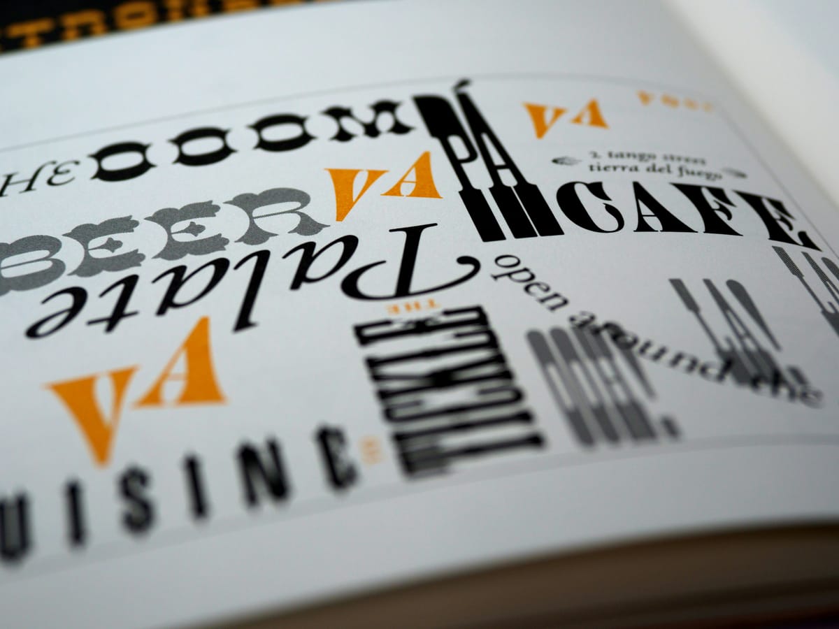
Surprising, though, transparency may actually work against understanding the authors message if it becomes too easy to read. When people feel overly fluent while reading, they tend to pay less attention to what is being read. Instead, introducing a certain amount of disfluency into the design — making the text less legible — may actually increase the reader’s ability to remember and process the information by adding a little bit of friction to slow them down.
According to a study contacted by Daniel Oppenheimer and colleagues at the Princeton University Department of Psychology:
When people find something easy to read [fluent], they take that as a sign that they’ve mastered it. Conversely, the researchers believe harder-to-read fonts provoke a feeling of lack of mastery and encourage deeper processing.
They found that by using typography that forces the reader to more sharply focus their attention actually aids in the retention and deeper processing of the information they are reading. In fact, they found by increasing disfluency in the text by using handwriting fonts like comic-sans at lower contrast levels — traits that are commonly associated with poorer legibility — they actually improved student learning in testing by forcing them to engage more deeply with the material.
A number so called “desirable difficulties” [disfluent] show that when people process information deeply they learn more effectively, and depth of processing is not necessarily easy.
This problem with monotonous legibility being harder to process is likely tied to repetition blindness, a human condition where our consciousness flies on auto-pilot when we stop seeing significant changes in our environment.
There needs to be more study on the effect of disfluency in design, but this helps explain why design is so important to creating meaningful communication. Designers inherently know that text that is monotonous is not easily processed. Our job as designers, then, isn’t to make the page “pretty” for the sake of aesthetics, but engaging in order to keep the reader’s interest.
Does this mean that readability doesn’t matter?
Legibility and readability should not be chucked out with the bathwater in order to make text more interesting. Obviously, it is desirable to still be able to read the information as quickly as possible for sustained periods of time, but only if the end result is that the reader understands and remembers what they have read. And that is what good typography does: creates a flow that empowers the reader to understand and remember what they have read as quickly as possible.
Professor Oppenheimer comments “Anything that makes the text slightly harder to read — for example, contrast — could make a difference.”